Export analytics from Studio
Start from: The Flow Learning dashboard.
Access analytics in Studio
- Navigate to Learning & Development > Studio.
- Select the lesson or assessment you want to review.
- In the editor, select Analytics (bar chart icon).
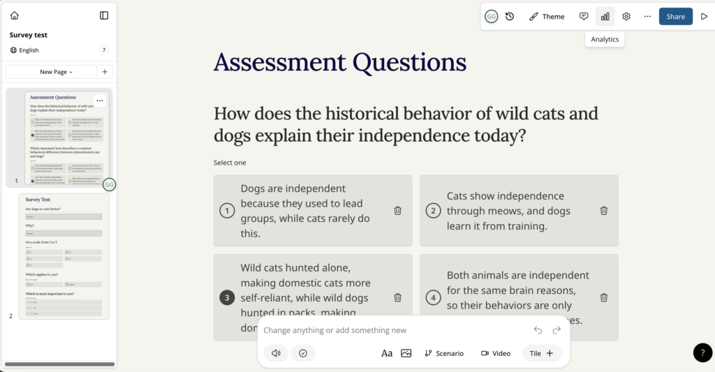
The Analytics window opens.
Review Results analytics
- Select the Results tab.
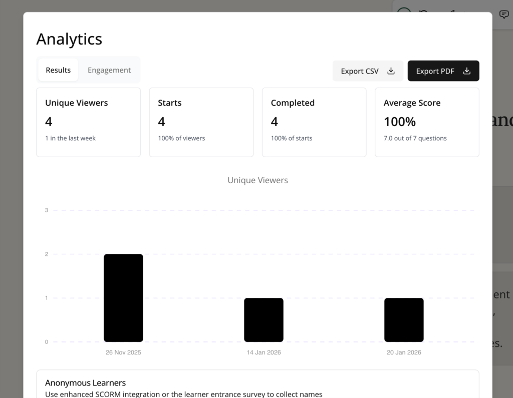
- Review the summary metrics, such as:
- Unique Viewers
- Starts
- Completed
- Average Score
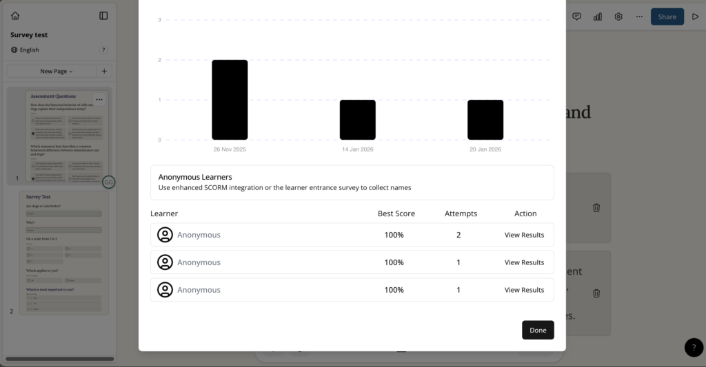
- (Optional) Scroll down to review learner-level results (for example, best score and attempts) and open individual entries where available.
- Select Export CSV to download the results data as a CSV file.
- Select Export PDF to download a PDF report.
Review Engagement analytics
- Select the Engagement tab.
- Review engagement metrics, such as:
- Average Completion time
- Per-page or per-tile engagement (for example, Percent Viewed and Avg Time)
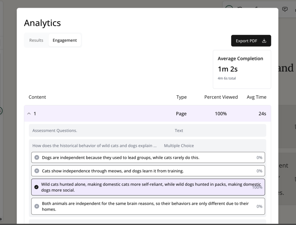
- Select Export PDF to download the engagement report as a PDF.