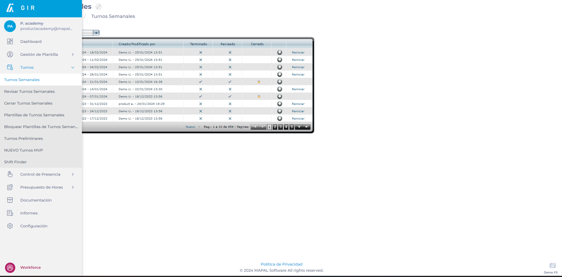
Départ de : Le module Main-d'œuvre.
-
Sélectionner Planification > Rotations hebdomadaires depuis le menu principal.
-
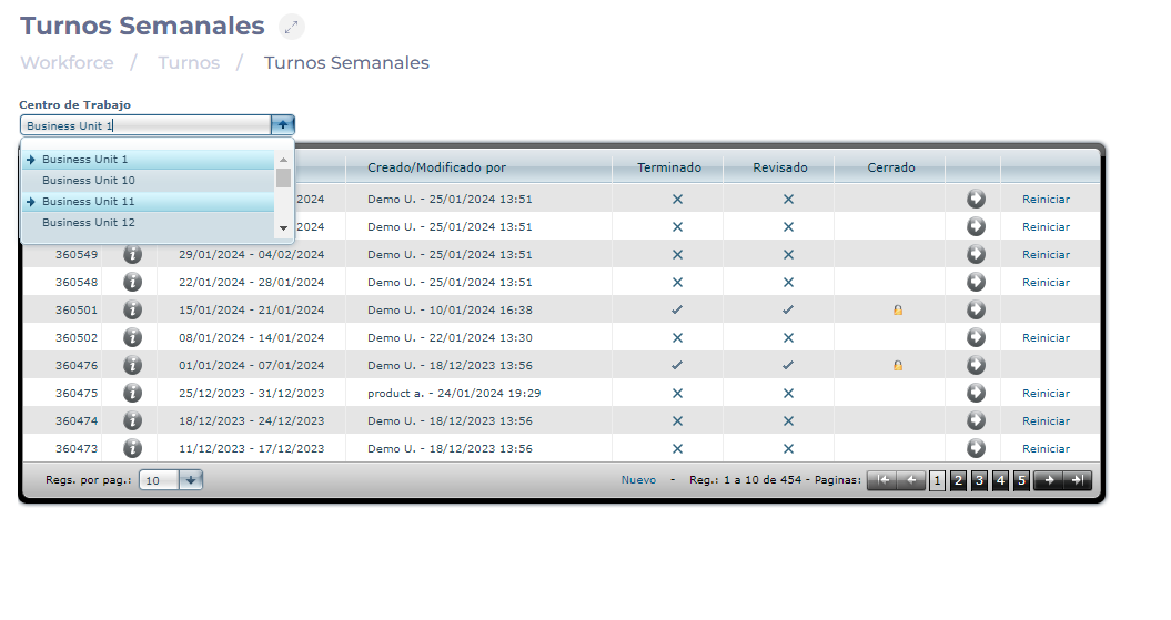
Sélectionnez le Centre de travail où se situe le changement que vous souhaitez analyser.
-
Sélectionnez le Flèche icon in the field of the shift you wish to analyze.
-
Sur l'écran Décalage projeté, sélectionnez l'option Analyse bouton.

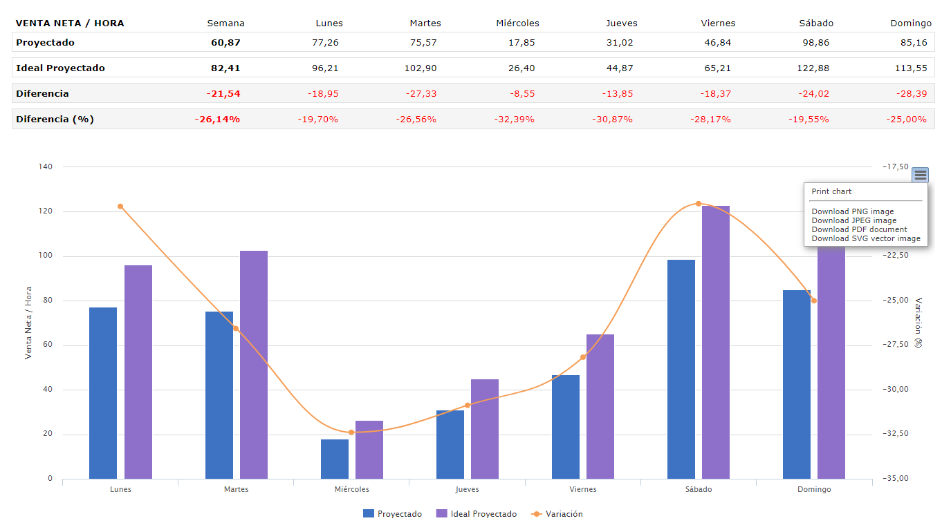
Productivity by total demand
Une fois le bouton Analyse sélectionné, l’écran suivant s’affiche :
-
Travail direct par défaut.
-
Défaut de travail indirect.
-
Excédent des heures projetées par rapport aux heures idéales.
-
Indicateur (KPI): this is the indicator that will be seen and studied in the report. Scroll down the list and select Productivity. Productivity can be measured using five possible ratios:
-
Net Hourly Sales
-
Hourly Tickets
-
Hourly Customers
-
Minutes per Ticket
-
Minutes per Customer
-
-
Poste de travail: productivity measurement can be done by total demand (the entire center) or by workstation. However, in order to be able to display it by workstations, there must be a previous configuration of direct work and indirect work (table by workstations) in the shift; otherwise, the option will be blocked.
-
Scénario: will be the context in which the selected KPI is integrated. It will be possible to choose between the Projected and, once the turn is over, also the Actual. In the case of productivity measurement, an additional drop-down appears to show the comparison options according to your selection:
-
If the scenario is Projected, the options will be: Projected vs Projected Ideal, and Projected vs Budget.
-
If the scenario is Actual, the options will be: Actual vs Projected, Actual vs Actual Ideal, Actual vs Budget.
-
Remarques : The term Ideal refers to the number of employees or hours that best fit the shifts based on budget and direct work configuration. Although the Ideal cannot always be reached due to legal regulations or personnel limitations, it is considered that the closer to the ideal, the better.
-
Période de temps: peut être hebdomadaire ou quotidien.

Metrics visualization
After selecting the parameters, in any of the cases, a table will be displayed with the productivity indicators for the selected days, as well as the comparisons that have been established in the Scenario.
The graphs to be shown are curves indicating productivity growth or decline over the selected period, as well as bars indicating day-to-day differences.
Graphics can be downloaded in image (.JPG, .PNG), document (.PDF), and vector (.SVG) formats.