


Start from: The Mapal Manager home screen.
What the dashboard shows at a glance
The Mapal Manager dashboard shows a summary of key sales indicators for the selected location and period.
You will see metric cards for:
- Net Sales: Total net revenue for the selected period.
- Checks: Number of bills or transactions served.
- Average Check: Average value per bill, calculated from Net Sales and Checks.
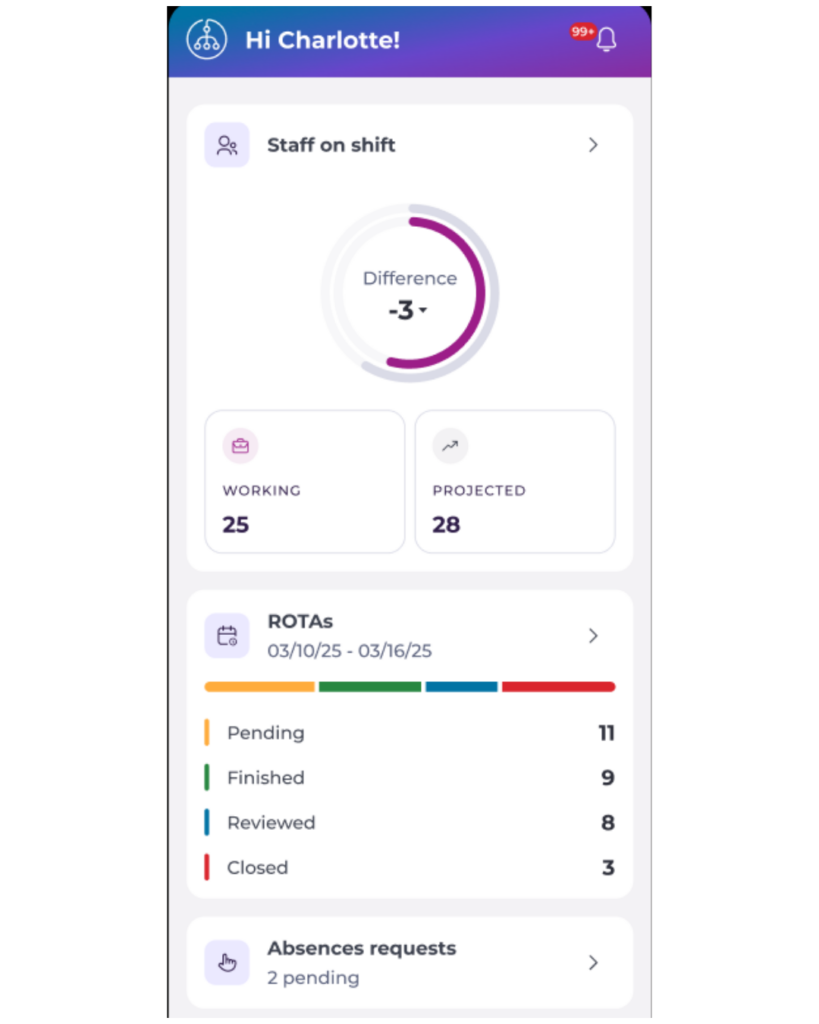
- Staff on Shift: Shows the number of staff currently working versus the projected headcount, and the difference between the two.
- ROTAs: Shows rota status for the current week, broken down by Pending, Finished, Reviewed, and Closed.
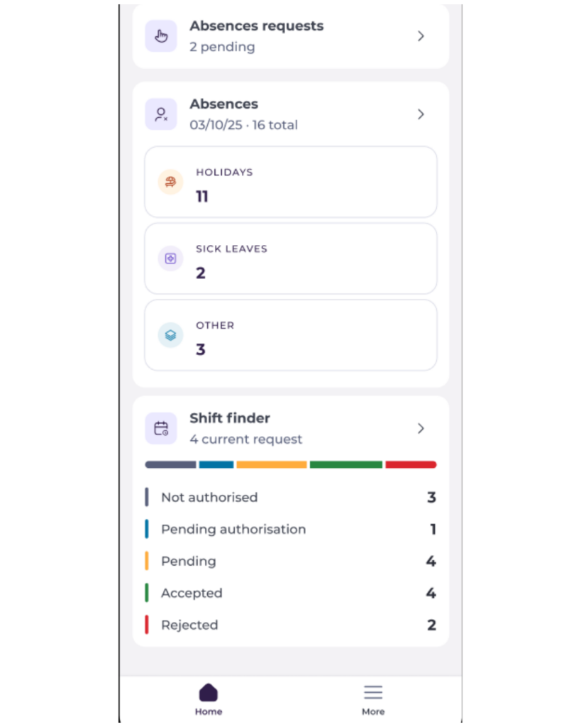
- Absences Requests: Shows the number of pending absence requests awaiting action.
- Absences: Shows today's total absences broken down by type: Holidays, Sick Leaves, and Other.
- Shift Finder: Shows the number of current open shift requests, broken down by status: Not Authorised, Pending Authorisation, Pending, Accepted, and Rejected.
 |  |
Switch between operators or business units
If you manage more than one site or operator, you can change context directly from the dashboard.
- On the Mapal Manager dashboard, open the location selector.
- Choose the Operator.
- Select the Site you want to review.
The dashboard will refresh to show sales and staffing information for the selected location.
Note: Your access depends on your user permissions. If you cannot see a site you expect, contact your administrator.
Navigate to other modules from the dashboard
The Mapal Manager dashboard acts as a starting point for the main Mapal Manager modules.
From the home screen, you can:
- Open Sales for a deeper view of sales performance, with grouping and comparisons.
- Open Staff on Shift to see who is currently clocked in and any attendance exceptions.
- Open Absences to review, create or approve absence requests.
- Open ROTAs to see rota status and staffing for the day.
- Open Shift Finder to review open shifts, candidates and coverage decisions.
Understand the layout and indicators
The dashboard is built around simple metric cards and trends. Each metric card usually includes:
- A label (Net Sales, Checks, Average Check).
- A main value for the selected period.
- A percentage change compared with the reference period.
- A trend indicator (arrow and colour).
How to read the indicators:
- Green arrow up and positive percentage; performance is better than the comparison period.
- Red arrow down and negative percentage; performance is lower than the comparison period.
- Neutral colour or small change; performance is broadly in line with the comparison.
Workforce cards such as Staff on Shift, ROTAs, Absences, and Shift Finder display counts and status breakdowns rather than trend indicators, giving you a quick snapshot of current operational status.