


Start from: The home screen in Mapal Manager.
Where you see the key metrics
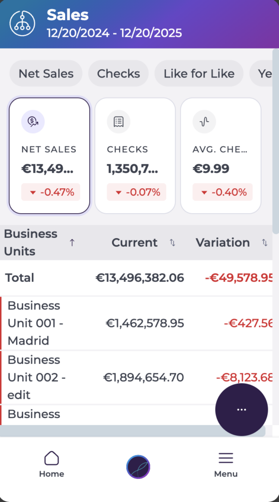
On the Sales screen, three metric cards are always visible at the top:
- Net Sales
- Checks
- Average Check
Each card shows a main value, a percentage change versus the comparison scenario, and a colour or arrow indicating whether performance is up or down. These cards update automatically when you change the business unit, period, comparison scenario or filters.
Net Sales
What it means
Net Sales is the total revenue for the selected period after discounts and corrections. It reflects the actual sales value recognised by the business, not just the raw takings.
How it is displayed
- A large total value for the selected date or range.
- A percentage underneath showing how Net Sales compares to the selected comparison scenario (for example, last year or last week).
- A coloured arrow or indicator showing whether Net Sales has increased or decreased versus that comparison.
How it behaves
Net Sales updates when you change:
- The business unit.
- The date or period.
- The comparison scenario.
- Any filters applied.
Net Sales always represents the overall total for the current view, not individual grouped values.
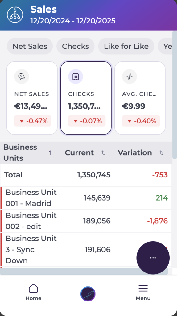
Checks
What it means
Checks represent the number of individual transactions or customer orders recorded during the selected period. It is a proxy for traffic or customer volume.
How it is displayed
- The total number of checks for the selected period.
- A percentage change versus the chosen comparison scenario.
- Colour or arrow indicators showing whether the number of checks is up or down.
How it behaves
Checks follow the same rules as Net Sales. The value changes when you update:
- Business unit.
- Date or period.
- Comparison scenario.
- Filters.
Use Checks to understand whether changes in revenue are being driven by more (or fewer) customer visits.
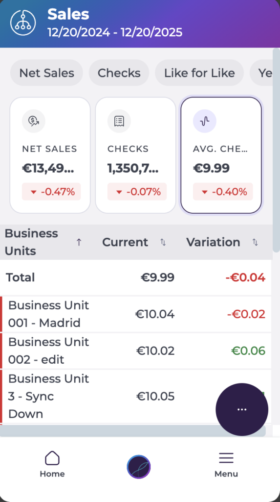
Average Check
What it means
Average Check is the average revenue per transaction. It is calculated as:
Average Check = Net Sales ÷ Number of Checks
This tells you how much, on average, each customer or order is spending.
How it is displayed
- A value calculated automatically from Net Sales and Checks.
- A percentage change relative to the selected comparison period.
- An indicator showing whether customer spend per visit has increased or decreased.
How it behaves
Average Check updates automatically when:
- Net Sales changes.
- Checks change.
- The period or comparison scenario changes.
You do not configure Average Check directly; it is always derived from the other two metrics.
Reading the metric cards together
Each metric card shares the same structure:
- A main figure (total or average).
- A percentage comparison based on the current comparison scenario.
- A colour or arrow indicating direction:
- Green/up: improvement versus the comparison period.
- Red/down: decline versus the comparison period.
- Grey/neutral: little change or not enough data.
The cards are not individually interactive. They respond when you change:
- Parameters (such as comparison scenario).
- Filters.
- Business unit.
- Saved scenarios.
Grouping options affect the breakdown list below the cards, but the three top metrics always show the overall totals for the current selection.
How to interpret the metrics
Used together, the three metrics help you understand both traffic and spend:
- Net Sales shows overall revenue.
- Checks shows customer volume.
- Average Check shows spend per order or customer.
Some common patterns:
- Higher Net Sales + lower Checks ? fewer visits, but higher spend per customer (Average Check up).
- Higher Checks + flat Average Check ? more customers, but similar spend per visit.
- Lower Net Sales + lower Checks ? reduced traffic and overall revenue, potential operational or demand issue.
By looking at all three cards together, you can quickly see whether today’s performance issues are driven by fewer customers, lower spend, or both, and adjust staffing, upselling focus or promotions accordingly.