


Start from: The Mapal Manager home screen.
What the Sales module is
The Mapal Manager Sales module gives you a mobile-friendly view of sales performance based on data from Mapal Analytics. It is designed so you can understand how your site is performing right now, without needing a laptop or full Analytics reports.
What the Sales module is for
Use the Sales module to:
- Check how today’s performance compares with the same period in the comparison range.
- See whether sales are trending up or down.
- Spot changes in customer volume (Checks) and spend (Average Check).
- Support operational decisions during a shift, such as staffing, upselling or menu focus.
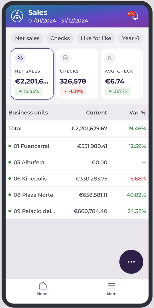
What the Sales screen shows
The Sales home screen focuses on three core metrics:
- Net Sales: total net revenue for the selected period.
- Checks: number of transactions or bills.
- Average Check: average revenue per check.
For each metric, you see:
- The current value for the selected site and period.
- The percentage change versus the chosen comparison period.
- A visual indicator (arrow and/or colour) showing whether the result is better or worse than the comparison.
These metric cards update automatically when you change parameters or filters.
Switch the business unit
If you have access to more than one site:
- On the Mapal Manager home screen, open the business unit selector.
- Choose the Operator if you work across multiple operators.
- Select the Site you want to review.
The Sales screen refreshes to show metrics for the selected site.
Note: What you can see depends on your user permissions. If a site is missing, contact your administrator. Multi-unit navigation is especially important for area or regional managers covering more than one location.
Open parameters and filters
The Sales module includes parameters that change how data is displayed, without changing the underlying figures.
- From the Sales home screen, select the More options button.
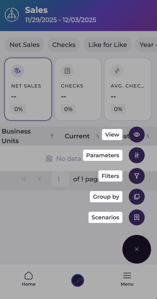
- Here, you will have five options:
- View: Lets you change the comparison value per variation or percentage variation.
- Parameters: Help you adjust the information you currently see on screen:
- Analysis type: which metric you want to focus on (Net or gross sales, traffic, comparison scenarios, reference periods).
- Date or period: for example, week to date, month to date, year to date, or a custom range.
- Types and sales periods: Select specific sales types and periods.
- Data source (Others): for example, Cashrec or POS.
- Filters: Apply specific Filters to craft your sales dashboard the way you need it.
- Group by: Set specific grouping options for your data.
- Scenarios: Create new scenarios from the data you are currently seeing, or retrieve previously created scenarios.
Changing these parameters keeps the metric card format the same, but changes the “story” the data is telling by shifting the time window or comparison.
Switch between metric cards and group views
Metric cards
At the top of the Sales screen, you always see Net Sales, Checks, and Average Check. Each metric card shows:
- Current value for the selected period and filters.
- Percentage change versus the comparison period.
- A colour or arrow indicating whether performance is up or down.
The cards update whenever you change parameters, filters or groupings. They are designed for quick decision-making so you can understand performance in seconds without scrolling.
Group views and breakdowns
Below the metric cards, the screen can show a breakdown list based on your grouping choice. The metric cards always show the overall totals for the selected filters. However, the list under the cards changes to reflect the chosen grouping.
- Grouping by business unit shows totals for each site.
- Grouping by brand shows totals by brand.
- Grouping by region shows totals by region.
Grouping does not change the overall totals. It only changes how the data is split so that you can compare different parts of the business more easily.
Understand the visual indicators
Each metric card and row may include visual indicators:
- Green arrow: performance is higher than the comparison period.
- Red arrow: performance is lower than the comparison period.
- Neutral or grey: little or no change.
Percentage changes show how much the metric has moved versus the comparison period. Help you judge whether changes are minor fluctuations or significant shifts. You may see 0% or “no data” when:
- There is no activity in either the current or comparison period.
- The comparison period has no valid data to compare against.
Drill-down options
From the Sales screen, you may be able to access deeper views. Tap a metric card or list item to open a more detailed Sales view.
Use these drill-down options when:
- The Sales screen shows a change that you need to investigate.
- You want to understand which sites, brands or periods are driving the trend you see on the metric cards.