


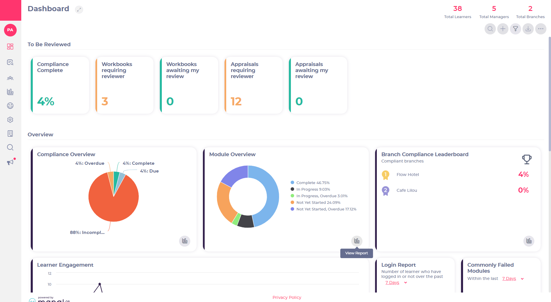
Starting point: The Flow Dashboard.
From the Dashboard, you can quickly access a number of useful day-to-day reports (e.g. Module overview, Modules due, Commonly failed modules) and you can also find a wide range of reports from within the Report tab on your main navigation (e.g., Full Training report, Learners Joiners and leavers).
Using The Module Overview tile on the dashboard as an example:
-
Select the View Report icon.
This will open up the report in the form of a chart, which will give you a visual overview.
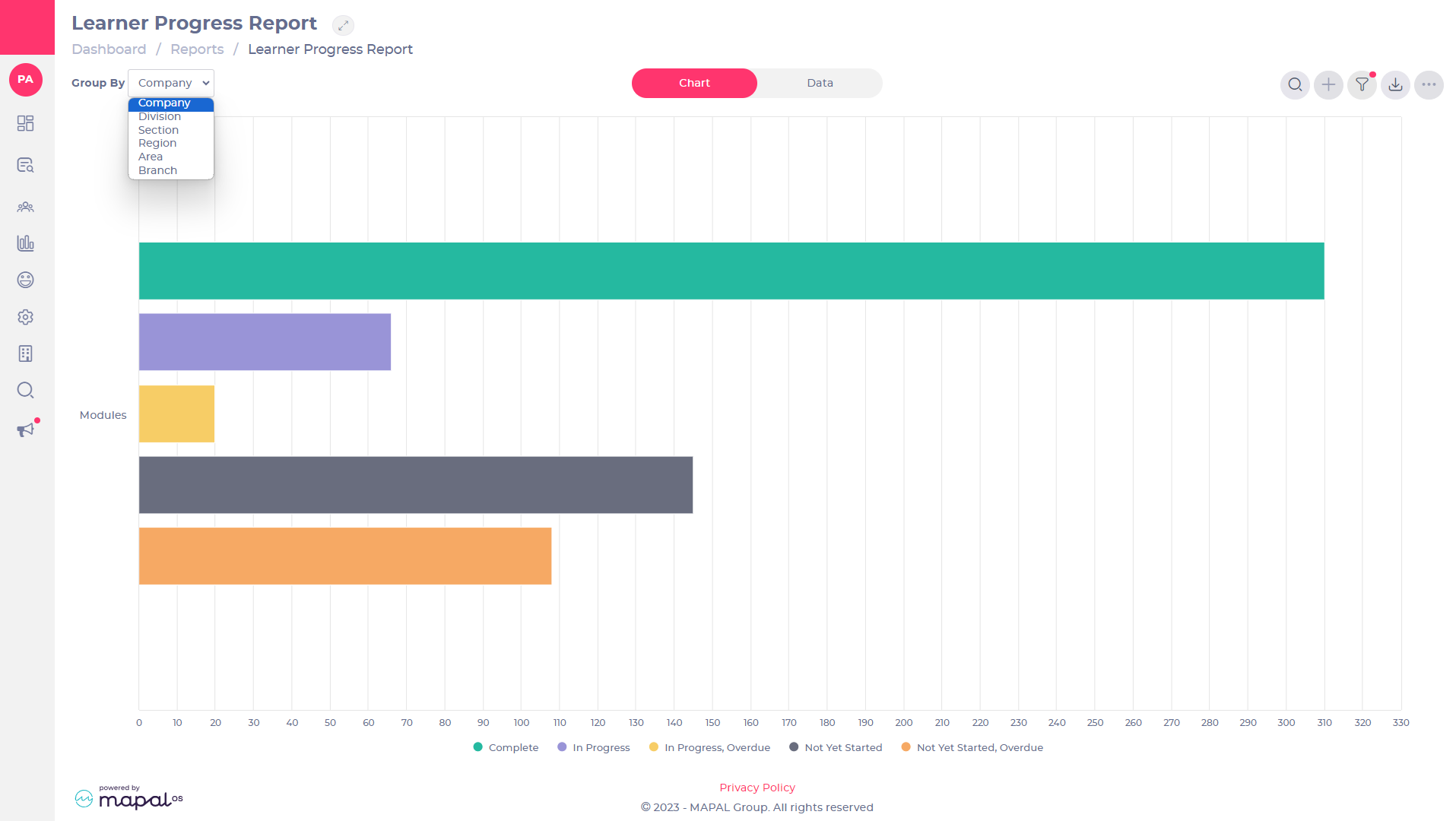
When a report is initially opened, it will display a graph showing the highest company level (available to them). This is a high-level view of the progress of their area. Users can then use the ‘Group by’ dropdown to change how they want the data to be displayed.
Reports can be grouped by the reporting levels of the platform (area, region, branch), allowing users to get a view of progress per branch, area, or region.
-
Select the Group By dropdown menu to view the report at different company levels.
Note: The Group By function is not applicable to every report.
-
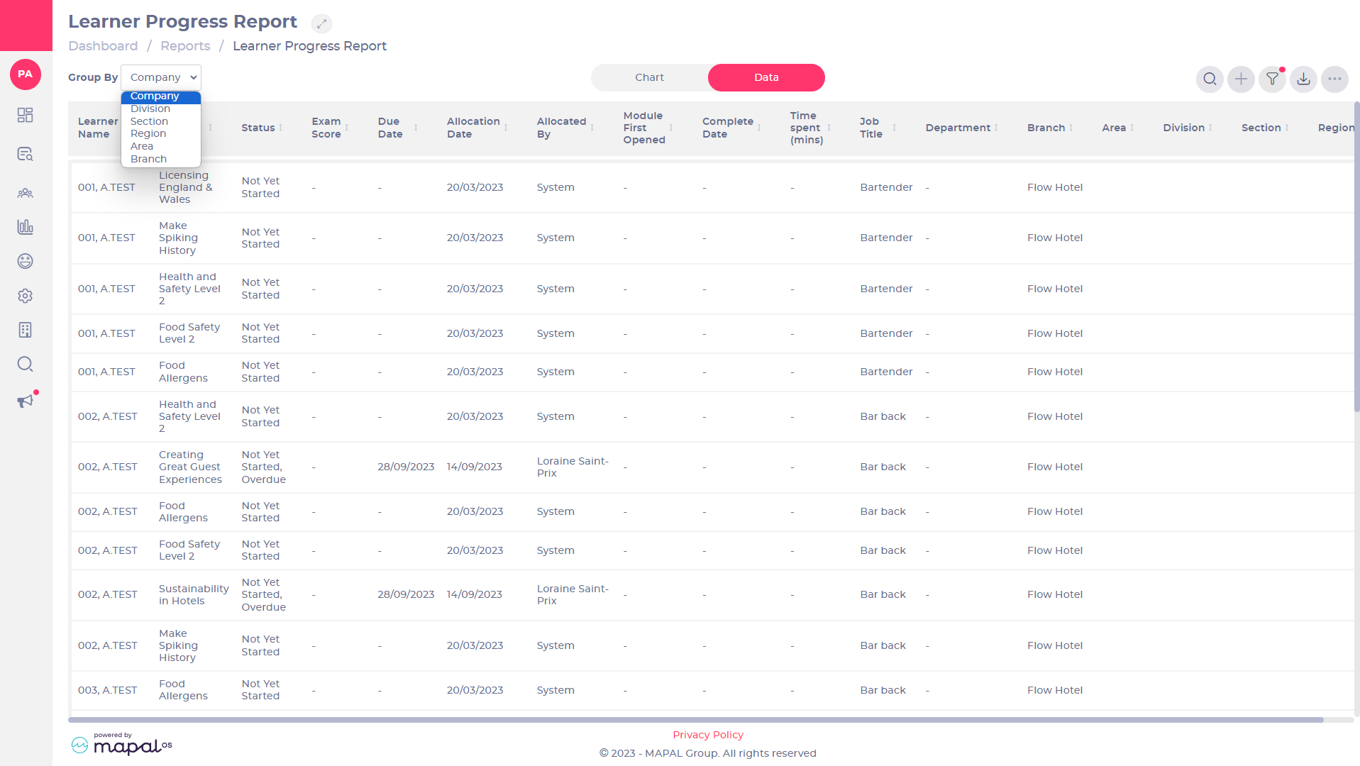
Slide the Report toggle from Chart to Data. This opens a different way to view the information within the report providing more details.
-
Select the Group By dropdown menu to view the report at different company levels. Note: The Group By function is not applicable to every report.
-
Select the Filter icon to filter the information in the report using any of the available options.
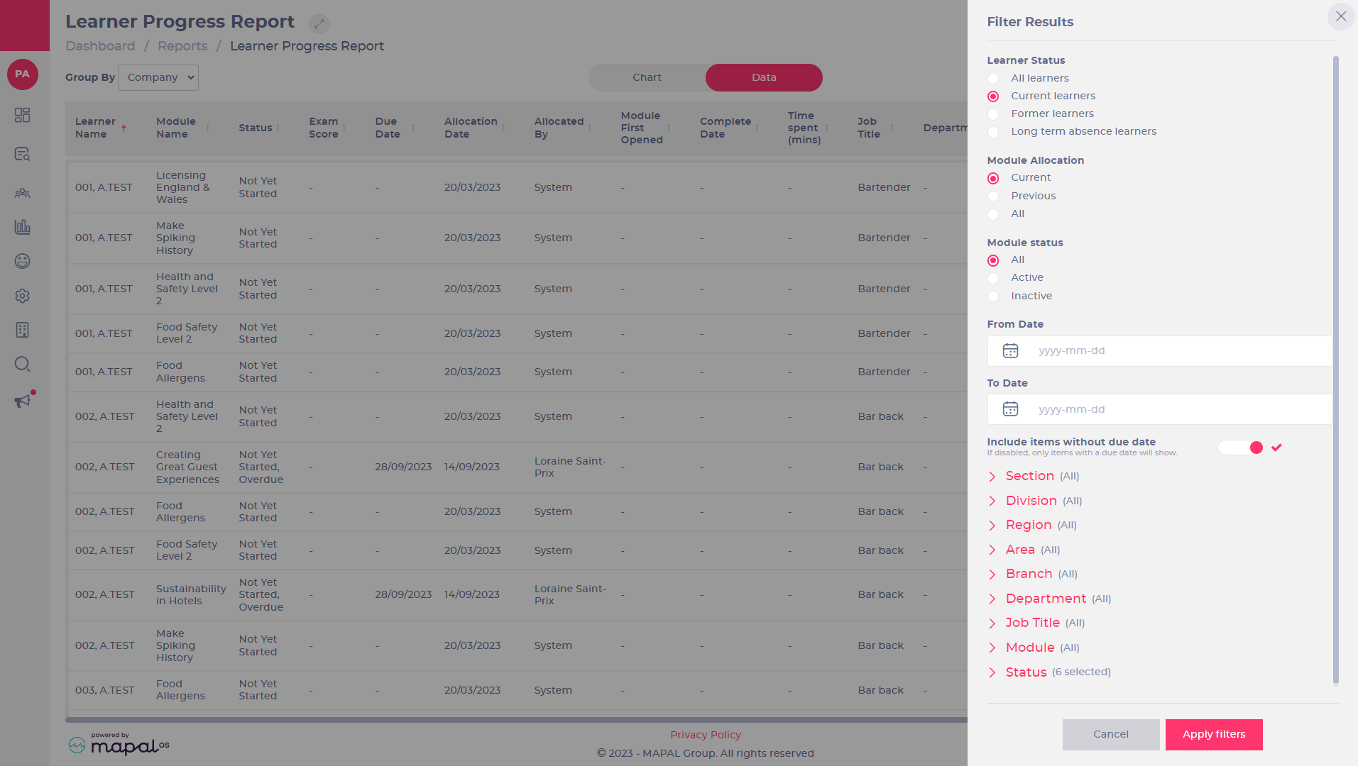
Filter the results based on dates, job titles, modules, status of modules or even based on branch, region and area, depending on your levels of permission.
-
Select the criteria for your filter.
-
Select Apply filters to change the report to match your set criteria.
Note: You will see a red dot by the icon to indicate when a filter is in place. -
Select the Export icon to export the Data page as a CSV file, OR to export the Chart page as a JPEG or PDF file.