


Start from: The Engagement dashboard.
- Navigate to Agile feedback > Overview.
- Select an Evaluation from the dropdown and select Load Dashboard.
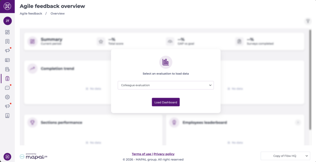
Understand the dashboard tiles and charts
Once an evaluation is loaded, the page is organised into a clear set of at-a-glance metrics and trend views.
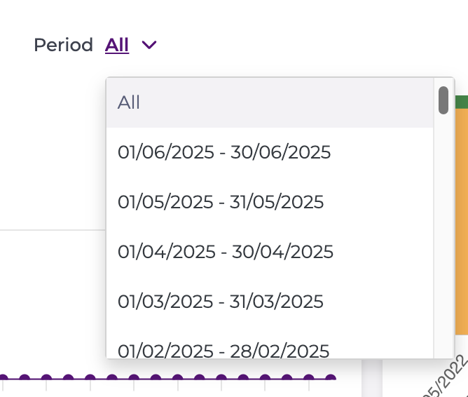
Period is set to All by default, so the tiles reflect the full history of the selected evaluation. Selecting a specific period changes which tiles are shown.
Summary (current period)
This strip provides a quick snapshot of the current period, including:
- Total score: Overall score achieved for the evaluation.
- GAP vs goal: The difference between current performance and the configured target.
- Surveys completed: Completion rate for the evaluation.
- Vs previous period: trend comparison for Total score and GAP vs goal. Green indicates an improvement on the previous period and red a decline.

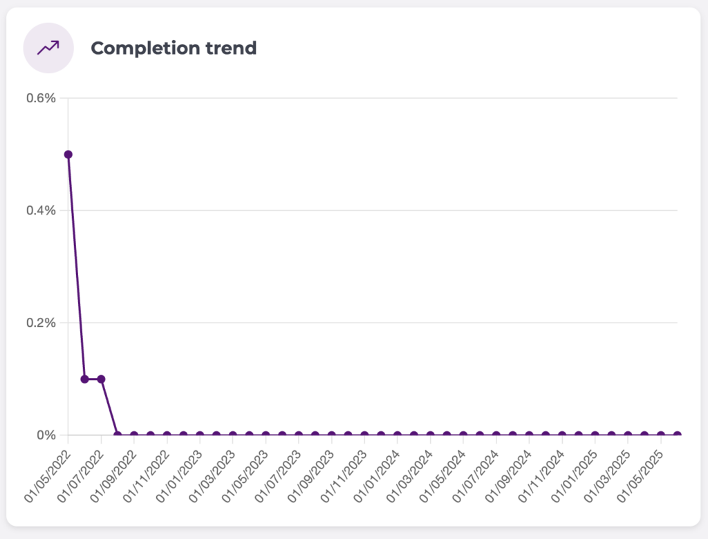
Completion trend
Shows how completion changes over time for the selected evaluation and period, helping you identify adoption patterns (for example, early activity vs drop-off).
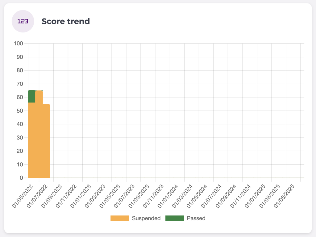
Score trend
Shows how scores evolve over time, typically split by result categories (for example, Passed vs Suspended) so you can see whether performance is improving or declining. The horizontal axis shows the date of each period and the vertical axis the average score percentage.
Evaluation completion
When you select a specific period rather than All, this replaces the summary strip. It shows the split between Completed and Not answered, each with its percentage and its comparison with the previous period.
Score percentage distribution
Also shown when a specific period is selected. It shows how many employees fall into each score range, from 0–10 up to 91–100, split by Passed and Suspended. This shows how employees are clustered rather than just the average — for example whether most sit in a middle band or whether there is a long tail of low scores.
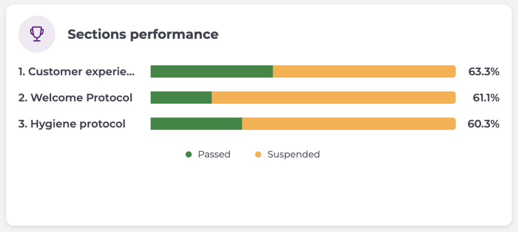
Sections performance
Breaks results down by section to highlight which parts of the evaluation are strongest and which need attention. Each section shows its Passed, Suspended and Not answered split alongside its overall percentage. Sections are ranked by performance, with the top five shown by default.
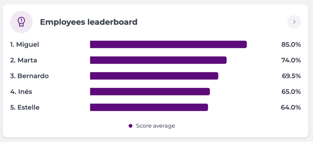
Employees leaderboard
Shows top-performing employees for the selected evaluation and period, so you can recognise strong performance and identify coaching opportunities. Each employee's average score is shown as a bar. When a specific period is selected, the previous period's score appears alongside the current one for direct comparison. The top five are shown by default.
Filter your view
At the top of the page, use the selectors to control what’s shown:
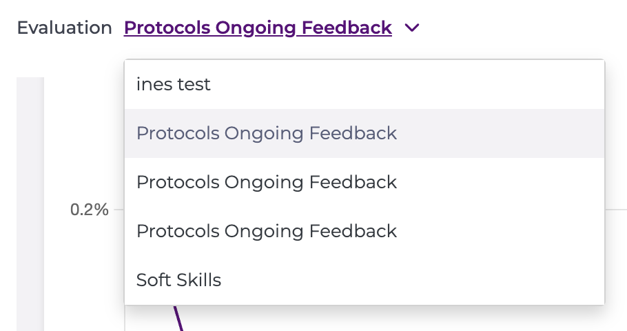
- Evaluation: Choose the evaluation you want to report on.
- Period: Choose the time period you want to review (for example, a specific cycle or All).
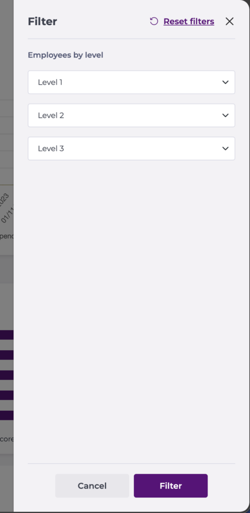
- Filter: refine what employees are included in the analysis per level.
- Select Level 1 (highest level).
- Select Level 2 (options update based on your Level 1 choice).
- Select Level 3 (options update based on your Level 2 choice).
- Select Filter to apply your selection and refresh the dashboard.
- To remove filtering and return to the full view, select Reset filters at the top of the drawer.
You can change these at any time to refresh the dashboard view. Active filters appear as chips below the selectors, so the scope of the data is always visible.
